as title
詳細可以參考: https://www.thedataschool.co.uk/wiktoria-rudz/waffle-chart-tableau/
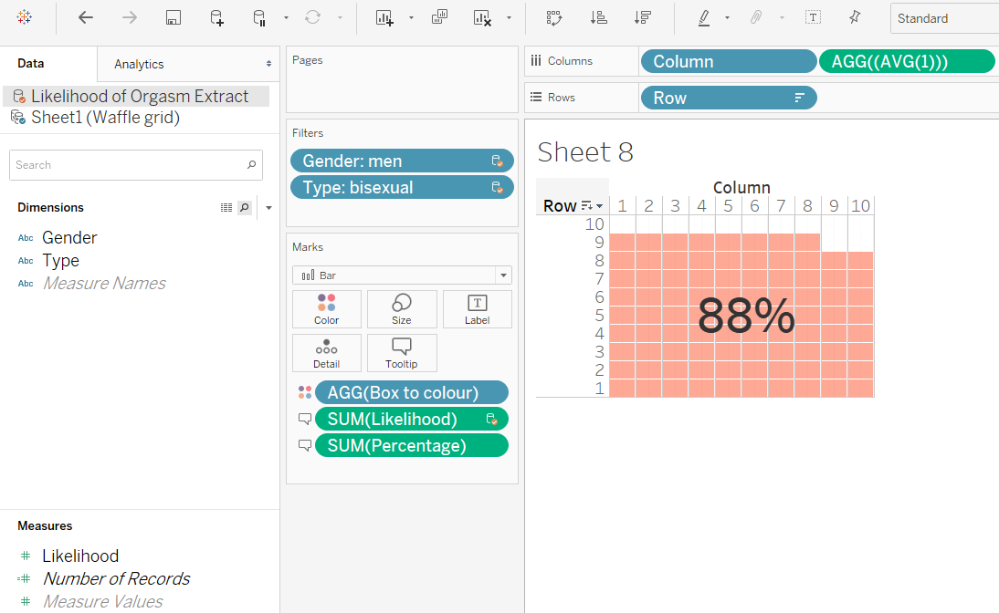
step1: 準備好Waffle grid data set
step2: 將column, row 拖拉至columns, rows並選擇長條圖.
step3: 利用AGV(1)將長條圖填滿
step4: 將寬度縮小為正方形
step5: 建立true,false, calculation field 用
--來源資料的資料和Waffle grid data set比較
SUM([Likelihood of Orgasm Extract].[Likelihood])>=SUM([Percentage])
step6: 將calculation field 拖拉到顏色
step7: 將SUM([Likelihood of Orgasm Extract].[Likelihood]) 拖拉到tooltips
step8: 最後右鍵添加Mark Annotation (並保留SUM([Likelihood of Orgasm Extract].[Likelihood]))
| Column | Row | Number of Records | Percentage |
| 1 | 1 | 1 | 1% |
| 1 | 2 | 1 | 11% |
| 1 | 3 | 1 | 21% |
| 1 | 4 | 1 | 31% |
| 1 | 5 | 1 | 41% |
| 1 | 6 | 1 | 51% |
| 1 | 7 | 1 | 61% |
| 1 | 8 | 1 | 71% |
| 1 | 9 | 1 | 81% |
| 1 | 10 | 1 | 91% |
| 2 | 1 | 1 | 2% |
| 2 | 2 | 1 | 12% |
| 2 | 3 | 1 | 22% |
| 2 | 4 | 1 | 32% |
| 2 | 5 | 1 | 42% |
| 2 | 6 | 1 | 52% |
同時也歡迎追蹤Tableau Public Gallery- MR.360 |聚沙成塔,裡面包含文章中的案例實作,
期待能帶給您新的啟發或靈感。
未來文章將喬遷新址「一趟數據分析之旅」,歡迎追蹤繼續支持,您將不會錯過任何新知識。