關於 Radius Button 的 Custom Render
今天上了James的課發現有另一個Custom Render 圓角Button的寫法供大家參考
1.Xamarin Form 專案的部分
在Form的專案建置一個RadiusButton Class 繼承自Button
using System;
using System.Collections.Generic;
using System.Linq;
using System.Text;
using System.Threading.Tasks;
using Xamarin.Forms;

namespace ButtonSample.CustomRender
{
    public class RadiusButton:Button
    {
    }
}
接著在Xaml中 加入 RadiusButton 的 引用參考
xmlns:CustomRender="clr-namespace:ButtonSample.CustomRender"
並在StackLayout中加入RadiusButton
<?xml version="1.0" encoding="utf-8" ?>
<ContentPage xmlns="http://xamarin.com/schemas/2014/forms"
xmlns:x="http://schemas.microsoft.com/winfx/2009/xaml"
xmlns:CustomRender="clr-namespace:ButtonSample.CustomRender"
x:Class="ButtonSample.Page.NewPage">
<StackLayout VerticalOptions="CenterAndExpand">
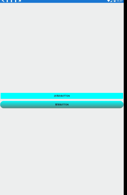
<Button Text="原來的Button" BackgroundColor="Aqua"></Button>
<CustomRender:RadiusButton Text="客製Button" BackgroundColor="Aqua" BorderRadius="100"/>
</StackLayout>
</ContentPage>
2.Android專案的部分
在android 專案的部分建一個class 叫做DroidApplication
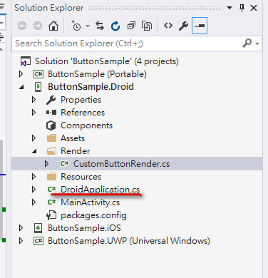
DroidApplication 程式碼如下
using Android.Content;
using Android.OS;
using Android.Runtime;
using Android.Views;
using Android.Widget;

namespace ButtonSample.Droid
{
    [Application]
    public class DroidApplication : Application
    {
        public static Context DroidContext {set;get;}
        public DroidApplication(IntPtr javaReference, JniHandleOwnership transfer)
            : base(javaReference, transfer)
        {

        }
    }
}
這邊的作用是宣告一個應用程式層級的靜態的 DroidContext (Context) 屬性,為了給之後render的原生的物件使用
接著在MainActivity中設置 自身的Activity 給 DroidApplication 的DroidContext
using System;

using Android.App;
using Android.Content.PM;
using Android.Runtime;
using Android.Views;
using Android.Widget;
using Android.OS;

namespace ButtonSample.Droid
{
    [Activity(Label = "ButtonSample", Icon = "@drawable/icon", Theme = "@style/MainTheme", MainLauncher = true, ConfigurationChanges = ConfigChanges.ScreenSize | ConfigChanges.Orientation)]
    public class MainActivity : global::Xamarin.Forms.Platform.Android.FormsAppCompatActivity
    {
        protected override void OnCreate(Bundle bundle)
        {
            TabLayoutResource = Resource.Layout.Tabbar;
            ToolbarResource = Resource.Layout.Toolbar;

            base.OnCreate(bundle);

            //設定context 給Application的Context 屬性
            DroidApplication.DroidContext = this;

            global::Xamarin.Forms.Forms.Init(this, bundle);


            LoadApplication(new App());
        }
    }
}
接著在drawable 資料夾右鍵new 一個 item 為 xml file 命名為buttonStyle
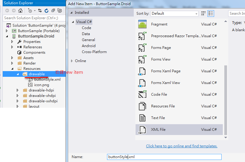
XML內容如下
<?xml version="1.0" encoding="utf-8"?>
<selector xmlns:android="http://schemas.android.com/apk/res/android" >
  <!--單擊-->
  <item android:state_pressed="true" >
    <shape android:shape="rectangle"  >
      <corners android:radius="100dp" />
      <solid android:color="#7FFFD4"/>
      <stroke android:width="1dip" android:color="#7FFFD4" />
    </shape>
  </item>
  <!--預設的樣式-->
  <item >
    <shape android:shape="rectangle"  >
      <!--圓角-->
      <corners android:radius="100dp" />
      <!--邊框-->
      <stroke android:width="1dip" android:color="#fff" />
      <!--背景-->
      <solid android:color="#00FFFF"/>
      <!--漸層-->
      <gradient android:angle="-90" android:startColor="#00FFFF" android:endColor="#58857e" />
    </shape>
  </item>
</selector>
2個item 在不同的狀態下有不同的外觀,state_pressed=true 表示單擊的效果
其他的狀態這邊有更多說明,
可參考:https://developer.android.com/guide/topics/resources/drawable-resource.html
這邊只使用預設跟按下
shape指的是物件的形狀,有正方形,橢圓,線行,環形
包在shape下有以下幾個屬性
corner指的是邊角的弧度,可以指定左上,右上,左下,右下的弧度
stroke可以指定外框的粗細跟顏色
solid 背景顏色
gradient 漸層效果
更多說明如下
可參考:https://developer.android.com/guide/topics/resources/drawable-resource.html#Shape
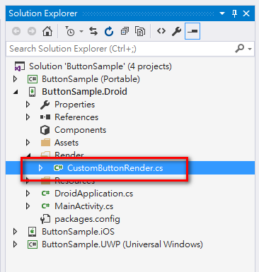
接著建一個CustomButtonRender 的Class
CustomRender是透過一個繼承ButtonRender的物件將Xamarin Form 的RadiusButton 轉換為一個已經客製的原生物件
首先在namespace 上宣告一個attribute [assembly:ExportRenderer(typeof(RadiusButton),typeof(CustomButtonRender))]
這裡的概念是從剛剛宣告的Application 層級的context 去取得drawable 的 buttonStyle
將drawble 設定給原生物件的background
稍微注意一下android 5.0 以上跟以下取得drawable的方式不一樣,有個分野避免程式crash
using System;
using System.Collections.Generic;
using System.Linq;
using System.Text;

using Android.App;
using Android.Content;
using Android.OS;
using Android.Runtime;
using Android.Views;
using Android.Widget;
using Xamarin.Forms;
using Xamarin.Forms.Platform.Android;
using ButtonSample.CustomRender;
using ButtonSample.Droid.Render;
using Android.Graphics.Drawables;

[assembly:ExportRenderer(typeof(RadiusButton),typeof(CustomButtonRender))]
namespace ButtonSample.Droid.Render
{
    public class CustomButtonRender: ButtonRenderer
    {
        protected override void OnElementChanged(ElementChangedEventArgs<Xamarin.Forms.Button> e)
        {
            base.OnElementChanged(e);

            if (this.Control != null)
            {
                Drawable drawable;
                Context context = DroidApplication.Context;

                if (Build.VERSION.SdkInt < Android.OS.BuildVersionCodes.Lollipop)
                {
                    //5.0以下的做法
                    Int32 _flagResourceId = this.Resources.GetIdentifier("buttonStyle", "drawable", context.PackageName);
                    drawable = Resources.GetDrawable(_flagResourceId);
                }
                else
                {
                    drawable = context.GetDrawable(Resource.Drawable.buttonStyle);
                }

                Control.SetBackgroundDrawable(drawable);
                //ButtonSampleDrod.Context
            }

        }
    }
}
也可以做到跟今天課堂上類似的效果