之前寫過一個 簡單操控 Chart.js 的文章 - [Javascript] 簡單試寫 Chart.js - Line Chart , Pie Chart ,但是遇到一些問題就是,因為處理數字很大,所以顯示出來的 Y 軸長這樣子..
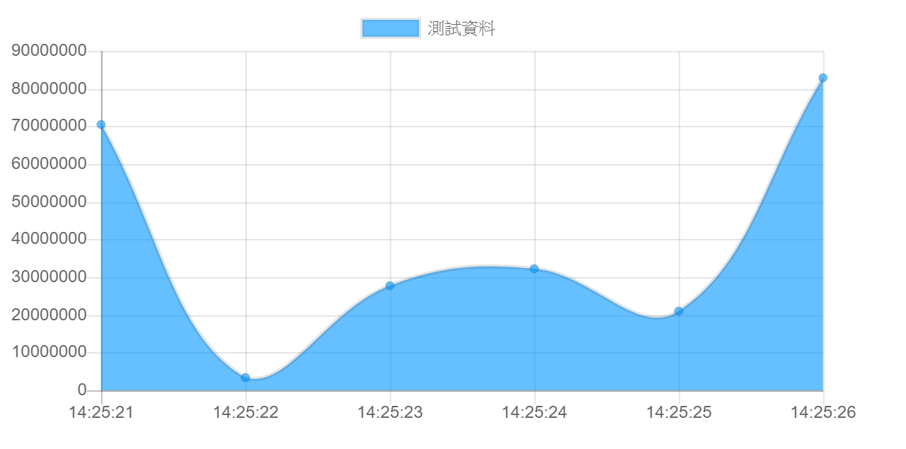
導致,左邊閱讀不容易,因為網路上找到許多方法測是不一定成功,所以我就把我手上測試成功後的 code 做一個筆記
主要是 Options 加上 scale 還有 tooltip
This file contains bidirectional Unicode text that may be interpreted or compiled differently than what appears below. To review, open the file in an editor that reveals hidden Unicode characters.
Learn more about bidirectional Unicode characters
options: { | |
responsive: true, | |
maintainAspectRatio: false, | |
scales: { | |
yAxes: [{ | |
scaleLabel: { | |
display: true, | |
labelString: '垂直軸的資料名稱' | |
}, | |
ticks: { | |
beginAtZero: false, | |
callback: function (value, index, values) { | |
return value.toLocaleString(); | |
} | |
} | |
}] | |
}, | |
tooltips: { | |
mode: 'label', | |
label: 'mylabel', | |
callbacks: { | |
label: function (tooltipItem, data) { | |
return tooltipItem.yLabel.toString().replace(/\B(?=(\d{3})+(?!\d))/g, ","); | |
} | |
} | |
} | |
} |
Result:
---
請你暫時把你的勇氣給我 在夢想快消失的時候 讓我的 Code 用力的穿過天空 為愛我的人做一秒英雄 如果這篇文章有幫助到您,簡單留個言,或是幫我按個讚,讓我有寫下去的動力...