簡述 WPF 的 ListBox 的樣式(Style)結構。
ListBox 是一個很常用到的控制項,
今天就來介紹 WPF 的 ListBox 組成要素。
首先開啟一個 WPF 專案,並將 ListBox 控制項拉到到畫面中,
點選滑鼠右鍵會出現 Edit Template 選項,如下圖
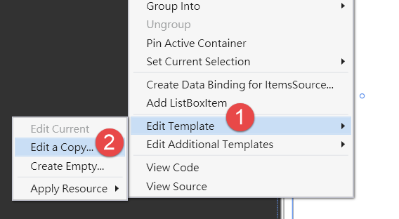
選擇 Edit Template > Edit a Copy...。
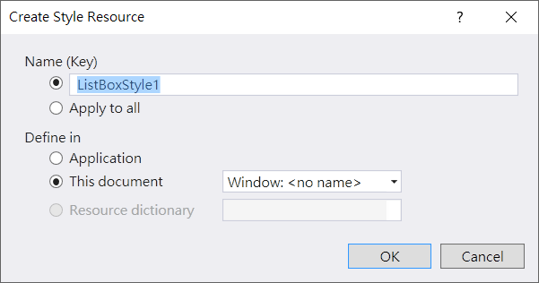
接著出現要我們決定 Style 的名稱和位置(如下圖),直接按 OK。
之後會發現在 xaml 檔案裡多出了 ListBox 的 Style 設定,樣板如下
<SolidColorBrush x:Key="ListBox.Static.Background" Color="#FFFFFFFF"/>
        <SolidColorBrush x:Key="ListBox.Static.Border" Color="#FFABADB3"/>
        <SolidColorBrush x:Key="ListBox.Disabled.Background" Color="#FFFFFFFF"/>
        <SolidColorBrush x:Key="ListBox.Disabled.Border" Color="#FFD9D9D9"/>
        <Style x:Key="ListBoxStyle1" TargetType="{x:Type ListBox}">
            <Setter Property="Background" Value="{StaticResource ListBox.Static.Background}"/>
            <Setter Property="BorderBrush" Value="{StaticResource ListBox.Static.Border}"/>
            <Setter Property="BorderThickness" Value="1"/>
            <Setter Property="Foreground" Value="{DynamicResource {x:Static SystemColors.ControlTextBrushKey}}"/>
            <Setter Property="ScrollViewer.HorizontalScrollBarVisibility" Value="Auto"/>
            <Setter Property="ScrollViewer.VerticalScrollBarVisibility" Value="Auto"/>
            <Setter Property="ScrollViewer.CanContentScroll" Value="true"/>
            <Setter Property="ScrollViewer.PanningMode" Value="Both"/>
            <Setter Property="Stylus.IsFlicksEnabled" Value="False"/>
            <Setter Property="VerticalContentAlignment" Value="Center"/>
            <Setter Property="Template">
                <Setter.Value>
                    <ControlTemplate TargetType="{x:Type ListBox}">
                        <Border x:Name="Bd" BorderBrush="{TemplateBinding BorderBrush}" BorderThickness="{TemplateBinding BorderThickness}" Background="{TemplateBinding Background}" Padding="1" SnapsToDevicePixels="true">
                            <ScrollViewer Focusable="false" Padding="{TemplateBinding Padding}">
                                <ItemsPresenter SnapsToDevicePixels="{TemplateBinding SnapsToDevicePixels}"/>
                            </ScrollViewer>
                        </Border>
                        <ControlTemplate.Triggers>
                            <Trigger Property="IsEnabled" Value="false">
                                <Setter Property="Background" TargetName="Bd" Value="{StaticResource ListBox.Disabled.Background}"/>
                                <Setter Property="BorderBrush" TargetName="Bd" Value="{StaticResource ListBox.Disabled.Border}"/>
                            </Trigger>
                            <MultiTrigger>
                                <MultiTrigger.Conditions>
                                    <Condition Property="IsGrouping" Value="true"/>
                                    <Condition Property="VirtualizingPanel.IsVirtualizingWhenGrouping" Value="false"/>
                                </MultiTrigger.Conditions>
                                <Setter Property="ScrollViewer.CanContentScroll" Value="false"/>
                            </MultiTrigger>
                        </ControlTemplate.Triggers>
                    </ControlTemplate>
                </Setter.Value>
            </Setter>
        </Style>
前面幾行是設定顏色,接著的 Setter 是設定控制項屬性的預設值,接著
整個 UI 的大架構是一個 Border 包著一個 ScrollViewer,再包著一個 ItemsPresenter,沒了! ListBox 的大架構就是這麼簡單。
剩下的
這裡設定了當 ListBox IsEnabled = false 的時候要改變的顏色,以及 ListBox 是 Grouping 的狀況下 ScrollViewer 不接受內容捲動。
我們可以試著在 ScrollViewer 加上 VerticalScrollBarVisibility="Visible" 屬性,
或是將上面的
接著我在 ListBox 裡面放一些資料,將 ListBox 的 xaml 改成如下
<ListBox Style="{StaticResource ListBoxStyle1}">
    <sys:Double>12.34</sys:Double>
    <sys:Double>56.78</sys:Double>
    <sys:String>第三個</sys:String>
</ListBox>
如此一來畫面上的 ListBox 就會出現三行內容。
同樣的我們在 ListBox 上按滑鼠右鍵,選擇 Edit Additional Templates,如下圖
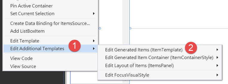
可以看到這次子選單有四個項目,FocurVisualStyle 就不提了,和 ListBox 架構基本上沒關係。
我們先從第一個看起。
選擇 Edit Additional Templates > Edit Generated Items (ItemTemplate) > Create Empty... ,會出現和上面一樣要你取名字的對話框,直接按OK。
將 DataTemplate1 改成如下程式碼:
<DataTemplate x:Key="DataTemplate1">
    <StackPanel Background="Red" Orientation="Horizontal">
        <TextBlock Text="Content="/>
        <TextBlock Text="{Binding Mode=OneWay}"/>
    </StackPanel>
</DataTemplate>
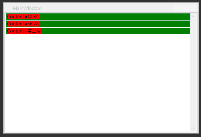
我將內容的顯示方式加上紅色的背景,可以即時看到畫面變成如下圖
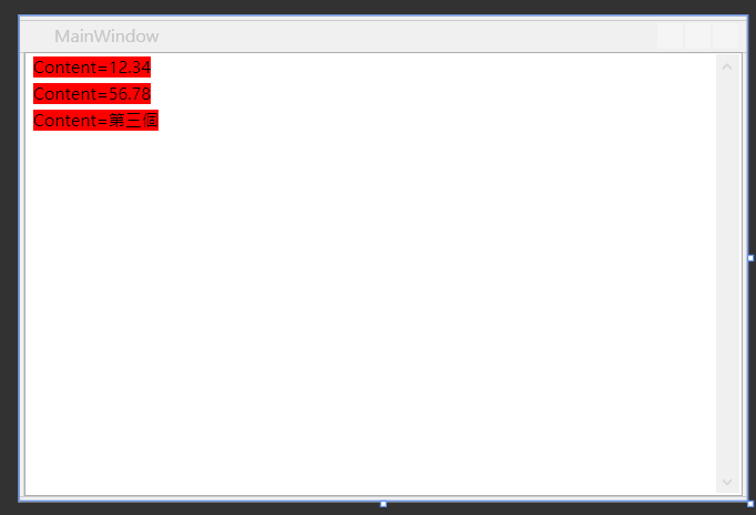
由此可知 ItemTemplate 是用來設定 ListBox 裡面的內容要用怎樣的方式呈現。
但是仔細觀察,可以發現每個資料之間有空白,三筆資料並不是緊密相連的,
這是因為 ListBox 在顯示資料的時候,事實上是把資料放在 ListBoxItem 內來呈現,
我們接著就來研究這件事。
一樣,在 ListBox 按右鍵選擇 Edit Additional Templates > Edit Generated Item Container (ItemContainerStyle) > Edit a Copy...
馬上我們又會看到一堆新新的程式碼如下
<Style x:Key="ListBoxItemStyle1" TargetType="{x:Type ListBoxItem}">
            <Setter Property="SnapsToDevicePixels" Value="True"/>
            <Setter Property="Padding" Value="4,1"/>
            <Setter Property="HorizontalContentAlignment" Value="{Binding HorizontalContentAlignment, RelativeSource={RelativeSource AncestorType={x:Type ItemsControl}}}"/>
            <Setter Property="VerticalContentAlignment" Value="{Binding VerticalContentAlignment, RelativeSource={RelativeSource AncestorType={x:Type ItemsControl}}}"/>
            <Setter Property="Background" Value="Transparent"/>
            <Setter Property="BorderBrush" Value="Transparent"/>
            <Setter Property="BorderThickness" Value="1"/>
            <Setter Property="FocusVisualStyle" Value="{StaticResource FocusVisual}"/>
            <Setter Property="Template">
                <Setter.Value>
                    <ControlTemplate TargetType="{x:Type ListBoxItem}">
                        <Border x:Name="Bd" BorderBrush="{TemplateBinding BorderBrush}" BorderThickness="{TemplateBinding BorderThickness}" Background="{TemplateBinding Background}" Padding="{TemplateBinding Padding}" SnapsToDevicePixels="true">
                            <ContentPresenter HorizontalAlignment="{TemplateBinding HorizontalContentAlignment}" SnapsToDevicePixels="{TemplateBinding SnapsToDevicePixels}" VerticalAlignment="{TemplateBinding VerticalContentAlignment}"/>
                        </Border>
                        <ControlTemplate.Triggers>
                            <MultiTrigger>
                                <MultiTrigger.Conditions>
                                    <Condition Property="IsMouseOver" Value="True"/>
                                </MultiTrigger.Conditions>
                                <Setter Property="Background" TargetName="Bd" Value="{StaticResource Item.MouseOver.Background}"/>
                                <Setter Property="BorderBrush" TargetName="Bd" Value="{StaticResource Item.MouseOver.Border}"/>
                            </MultiTrigger>
                            <MultiTrigger>
                                <MultiTrigger.Conditions>
                                    <Condition Property="Selector.IsSelectionActive" Value="False"/>
                                    <Condition Property="IsSelected" Value="True"/>
                                </MultiTrigger.Conditions>
                                <Setter Property="Background" TargetName="Bd" Value="{StaticResource Item.SelectedInactive.Background}"/>
                                <Setter Property="BorderBrush" TargetName="Bd" Value="{StaticResource Item.SelectedInactive.Border}"/>
                            </MultiTrigger>
                            <MultiTrigger>
                                <MultiTrigger.Conditions>
                                    <Condition Property="Selector.IsSelectionActive" Value="True"/>
                                    <Condition Property="IsSelected" Value="True"/>
                                </MultiTrigger.Conditions>
                                <Setter Property="Background" TargetName="Bd" Value="{StaticResource Item.SelectedActive.Background}"/>
                                <Setter Property="BorderBrush" TargetName="Bd" Value="{StaticResource Item.SelectedActive.Border}"/>
                            </MultiTrigger>
                            <Trigger Property="IsEnabled" Value="False">
                                <Setter Property="TextElement.Foreground" TargetName="Bd" Value="{DynamicResource {x:Static SystemColors.GrayTextBrushKey}}"/>
                            </Trigger>
                        </ControlTemplate.Triggers>
                    </ControlTemplate>
                </Setter.Value>
            </Setter>
        </Style>
前面幾行一樣是設定預設的屬性值,
我們專注在
主要的 UI 呈現也很簡單,就是一個 Border 包著 ContentPresenter,
ContentPresenter 就是存放資料的地方,這裡的例子就是那三行文字,
而那三行文字的 UI 要怎麼呈現,就是根據上面說過的 ItemTemplate 來設計。
下面的 Triggers 也稍微說明一下,
第一個是滑鼠移動到 ListBoxItem 上面時,UI的改變(IsMouseOver)。
第二個是 ListBoxItem 被選取(IsSelected),但卻不是鍵盤焦點(Selector.IsSelectionActive)時,UI的改變。
第三個是 ListBoxItem 被選取(IsSelected),同時也是鍵盤焦點(Selector.IsSelectionActive)時,UI的改變。
第四個是 ListBoxItem IsEnabled 是 false 時,UI的改變。
這裡我們將上面屬性設定
畫面就會變成下圖
還是有一點留白,那是 Border 的框,可以把
再來看第三個選項 Edit Layout of Items (ItemsPanel),
在 ListBox 按右鍵選擇 Edit Additional Templates > Edit Layout of Items (ItemsPanel) > Edit a Copy...
這次會產生如下程式碼
<ItemsPanelTemplate x:Key="ItemsPanelTemplate1">
    <VirtualizingStackPanel IsItemsHost="True"/>
</ItemsPanelTemplate>
這裡是決定 ListBox 要用怎樣的布局容器來放置資料,
預設都是 VirtualizingStackPanel ,我們可以在這邊放入其他的布局容器(Panel),
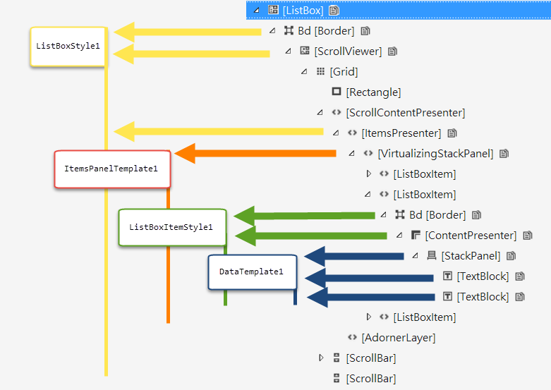
最後執行程式時,可以由視覺樹看出他們的階層關係,如下圖
如此一來,當想要改變 ListBox 的 UI 呈現時,就可以清楚的知道要修改那些 Template 了。