使用Material Design元件重新設計畫面
使用Material Design元件重新設計畫面
|
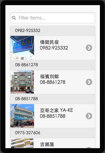
JQueryMobile 版 |
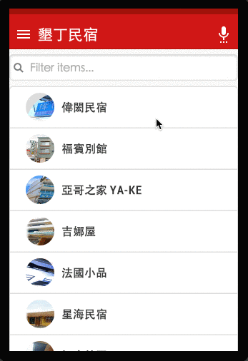
Material Design 版 |
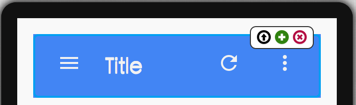
Step1: 增加 core-toolbar

Step2: 貼上CSS
貼上CSS並在 core-toolbar 加上 class="toolbar" , (選項) - 增加漸層 <div id="top-b"></div>
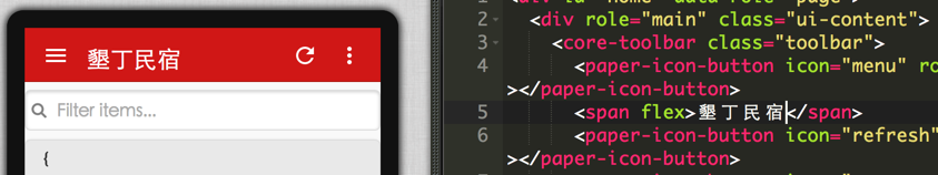
CSS用貼的就好了
|
@import url(http://fonts.googleapis.com/css?family=BenchNine); @import url(http://fonts.googleapis.com/css?family=Poiret+One); @import url(http://fonts.googleapis.com/css?family=Open+Sans+Condensed:300); @import url(http://fonts.googleapis.com/css?family=Archivo+Narrow); @import url(http://fonts.googleapis.com/css?family=Alegreya+Sans); @import url(http://fonts.googleapis.com/css?family=Roboto+Condensed); core-header-panel { float: left; width: 100%; height: 800px; margin: 0px; }
core-header-panel[mode=cover]::shadow #mainContainer { left: 70px; } .core-header { height: 60px; padding: 0 10px; color: #000; transition: height 0.2s; background-repeat:no-repeat; background-size: 100% 100%; } .core-header.tall { height: 180px; background-repeat:no-repeat; background-size: 100% 100%; background-color:#d01716; } .core-header > .title { line-height: 60px; font-size: 36px; bottom:0px; } .content { height: 3000px; background: linear-gradient(rgb(214, 227, 231), lightblue); } .address{ font-size:24px; margin:25px; font-family: 'Roboto Condensed'; } .remarks{ font-size:18px; margin:25px; font-family: 'Roboto Condensed'; } #gallery { text-align:center; } #gallery li,ul li img{ width:120px; height:120px; } .store { position:absolute; width:100%; line-height:32px; bottom:0px; background-color:#eee; text-align:center; } html, body, div[data-role="page"], .ui-content { height: 100%; width: 100%; padding: 0; margin: 0; text-shadow: none; font-family: 'Roboto Condensed'; } #top-b, .toolbar { position: relative; top: 0px; width: 100%; } #top-b { height: 8px; background: #a0120a; } .toolbar { background: #d01716; box-shadow: 0 1px 0 #b0120a; margin-bottom: 0px; height: 48px; color: #fff; top: 0px; } .toolbar span { margin-top: -8px; } .toolbar paper-icon-button { margin: -8px -8px 0; fill: #fff; } .item { height: 56px; border-bottom: 1px solid #EEE; } .item div { width: 40px; height: 40px; margin: 0 8px 0 8px; border-radius: 48px; overflow: hidden; background: #ddd; border: 2px solid #fff; } .item div img { height: 48px; } |
Step3: 更新 li 內容
使用paper-item元件,提供觸感回饋


更新li內容
|
<li is="listview-li" style="padding:0" data-id="{{siID}}"> <paper-item horizontal center layout class="item"> <div> <img src="{{iconURI}}"> </div><b>{{storeName}}</b> </paper-item> </li> |
|
preview 一下,感受觸感回饋的感覺 |
|
Step4: 串接Detail 畫面
為了保留觸感視覺效果,延遲換頁時間
並在onRow方法裏進行換頁
changePage('#detail','slide');
|
function changePage(pageId, tran, isR) { function change() { $.mobile.changePage(pageId, { transition: tran, reverse: isR }); } setTimeout(change, 500); } |
Step5: 優化Detail 畫面 (使用隱藏版,Core-Header-Panel)
|
<core-header-panel mode="waterfall-tall"> <div class="core-header"></div> <div class="content">
</div> </core-header-panel> |
將圖片改放到 core-Header-Panel 進行轉換效果
|
$('.core-header').css('background-image','url(' + imgsrc + ')'); |