from http://scorbs.com/
Motivation for the Parts & States Model
Custom controls are a type of Silverlight controls that have a strict separation between the control logic & control visuals. This is great for scenarios where you want to customize the visuals without affecting the logic, and vis versa.
While this strict separation has many benefits, it is often challenging for designers to know what elements in the template the control needs. What is missing is an explicit control contract.

If the control author provides an explicit control contract, the designer has a bill of materials for the control template. This enables easier skinning of controls.
Conceptually: Parts & States Model
The Parts & States model is a way of providing that control contract.
It is the recommended way to structure your Silverlight 2 controls. However, this pattern is not enforced by the runtime. You are free to build functioning controls that do not use the Parts & States Model.
That being said, not only do we do think the Parts & States Model is a good model - it is the model that Expression Blend supports. Therefore, if you want your control to be skinnable in Blend, you should build your control using the Parts & States paradigm.
At the highest level, there are four main concepts in the Parts & States Model:
- Parts
- States
- Transitions (between States)
- State Groups
Parts
Parts are named elements inside of a control template. The control logic expects these parts to appear in the template because it needs to manipulate them in some way.
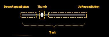
In the above slider example, there are 4 parts. Each will be programmatically accessed by the control code. When the UpRepeatButton is pressed, the control code moves the Thumb along the Track to the right. When the DownRepeatButton is pressed, the control code moves the Thumb in the opposite direction.
Not all controls need to programmatically manipulate elements in this way. Such controls (e.g. Button) will not have any Parts in their control contract.
States
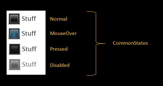
Visual states represent the way the control looks in a particular logical state.

For instance, the Button above has a light background when in the MouseOver state, and a dark background when in the Pressed state.
Transitions
Visual transitions represent the way the control looks as it transitions from one visual state to another.

Above, Button’s background gradually fades from a light color to a darker color as it transitions from the MouseOver to the Pressed state.
StateGroups
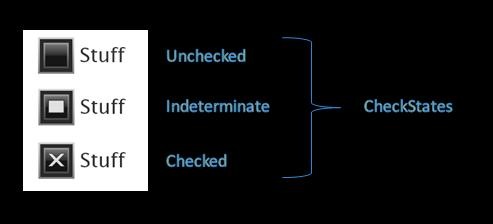
StateGroup are comprised of mutually exclusive states. State group themselves are orthogonal, meaning that a control can be in 2 different states as long as each of those states are in a different state group.

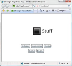
In the above CheckBox example, there are two state groups: CommonStates and CheckStates. A CheckBox can be in the MouseOver state and the Indeterminate state (for instance) because each of those states are members of a different state groups. On the other hand, it’s not possible for a CheckBox to be in the Normal and MouseOver state at the same time because they are two states in the same state group.
StateGroups are a new concept that we introduced in Beta2. They help reduce the “state explosion” that we saw in the Beta1 model. CheckBox has 7 states in Beta2 (plus 2 focus states). In Beta1, it had (AGH!) 12 states (focus was manipulates as a part and not a state).
Initiating State Changes
A state change starts when a control detects that, logically, it has changed state. It then initiates a visual state change, causing the appropriate visual transition and then visual state to be shown.
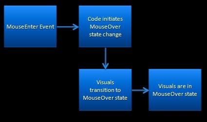
In the above example, for instance, a control detects a MouseEnter event. It then initiates a visual state change. The control’s visuals first show the appropriate transition and then rest in the MouseOver visual state.
A CheckBox ControlTemplate
ControlTemplates define the visuals for a custom control. The CheckBox ControlTemplate that we’ll be expanding on in this post is below.

1: <ControlTemplate TargetType="CheckBox">
2: <StackPanel x:Name="Root" ...>
3:4: <!-- OuterBorder -->
5: <Border Width="20" Height="20" ... >
6:7: <!-- InnerBorder -->
8: <Border x:Name="InnerBorder" ... >
9:10: <Grid>
11: ... 12:13: <!-- Higlight-->
14: <Border x:Name="HighlightBorder" ... />
15:16: <!-- Glow -->
17: <Rectangle x:Name="Glow" Opacity="0" ... />
18:19: <!-- Checkmark Graphic-->
20: <Path x:Name="Checkmark" Opacity="0" ... />
21:22: <!-- Indeterminate Rect-->
23: <Rectangle x:Name="IndeterminateRect" Opacity="0" ... />
24: </Grid>
25:26: </Border>
27: </Border>
28:29: <!-- ContentPresenter -->
30: <ContentPresenter .../>
31:32: </StackPanel>
33: </ControlTemplate>
Time to fix that!
Adding VisualStates & VisualStateGroups
As we discussed last time, the Parts & States Model introduces the notion of visual states and visual state groups.
In Silverlight 2, we wanted these ideas to be first class concepts and so we have made them into their own classes: VisualState and VisualStateGroup. They are managed by the VisualStateManager, which runs the visual state machine for the control.
Let’s see how to add VisualStates & VisualStateGroups to our CheckBox skin!
Adding VisualStateGroups to the CheckBox ContrlolTemplate
CheckBox has two primary state groups (it has 3 state groups total, but for simplicity, we’re going to ignore the focus group):
- CommonStates state group
- CheckStates state group
You add these state groups to the ControlTemplate like this:
1: <ControlTemplate TargetType="CheckBox">
2:3: <!-- Root Visual -->
4: <StackPanel x:Name="Root" ... >
5:6: <!-- VisualStateManager-->
7: <vsm:VisualStateManager.VisualStateGroups>
8:9: <!-- CommonStates StateGroup-->
10: <vsm:VisualStateGroup x:Name="CommonStates">
11:12: </vsm:VisualStateGroup>
13: 14:15: <!-- CheckStates StateGroup-->
16: <vsm:VisualStateGroup x:Name="CheckStates">
17:18: </vsm:VisualStateGroup>
19:20: </vsm:VisualStateManager.VisualStateGroups>
21:22: <!-- Rest of Template -->
23: ... 24:25: </StackPanel>
26: </ControlTemplate>
27:As you can see from this XAML, to add state groups you need to…
- use a vsm xmlns prefix
- This is required in Silverlight 2 because of a known bug.
- xmlns:vsm=”clr-namespace:System.Windows;assembly=System.Windows”
- add a VisualStateManager.VisualStateManager property
- This attached dependency property should be on the ControlTemplate’s root visual.
- In it, you define the different VisualStateGroups for that control
- include the appropriate VisualStateGroups
- Each VisualStateGroup is named and contains a set of mutually exclusive VisualStates.
Now that we’ve added the VisualStateGroups, the next step is to populate them.
Adding VisualStates to a VisualStateGroup
CheckBox has 7 states spread across these two state groups. Below is the CheckBox blueprint for its default skin.

Let’s start by adding the four visual states to our skin’s CommonStates:
1:2: <vsm:VisualStateGroup x:Name="CommonStates">
3:4: <!-- Normal State -->
5: <vsm:VisualState x:Name="Normal"/>
6:7: <!-- MouseOver State -->
8: <vsm:VisualState x:Name="MouseOver">
9: <Storyboard>
10: <DoubleAnimation
11: Storyboard.TargetName="Glow"
12: Storyboard.TargetProperty="Opacity"
13: Duration="0" To="1"/>
14: </Storyboard>
15: </vsm:VisualState>
16: 17:18: <!-- Pressed State -->
19: <vsm:VisualState x:Name="Pressed">
20: <Storyboard>
21: <DoubleAnimation
22: Storyboard.TargetName="HighlightBorder"
23: Storyboard.TargetProperty="Opacity"
24: Duration="0" To=".6"/>
25: <ColorAnimation
26: Storyboard.TargetName="InnerBorder"
27: Storyboard.TargetProperty="(Border.BorderBrush).(GradientBrush.GradientStops)[0].(GradientStop.Color)"
28: Duration="0" To="#FF000000"/>
29: <ColorAnimation
30: Storyboard.TargetName="InnerBorder"
31: Storyboard.TargetProperty="(Border.BorderBrush).(GradientBrush.GradientStops)[1].(GradientStop.Color)"
32: Duration="0" To="#FF000000"/>
33: </Storyboard>
34: </vsm:VisualState>
35:36: <!-- Disabled State -->
37: <vsm:VisualState x:Name="Disabled">
38: <Storyboard>
39: <DoubleAnimation
40: Storyboard.TargetName="Root"
41: Storyboard.TargetProperty="Opacity"
42: Duration="0" To=".7"/>
43: </Storyboard>
44: </vsm:VisualState>
45:46: </vsm:VisualStateGroup>
As seen above, the VisualState element…
- is named
- This is how VisualStateManager looks up a particular state in the template.
- contains a Storyboard
- This storyboard represents the ControlTemplate’s visual look when it is in that particular state.
- It can be a “static” storyboard, meaning that it is a zero duration storyboard whose look is held for the entire time the control is in that state. All of the above states have “static” storyboards.
- It could also be “steady state animation” storyboard. That is, a non-zero duration storyboard with a Forever repeat behavior. This represents a storyboard that has a continuously active animation, like a pulsating effect.
If you look at the particular states we just defined in our ControlTemplate:
- The Normal state does not define a Storyboard. This is because the Normal state looks the same as the “base” look of the ControlTemplate,
- The MouseOver state toggles the opacity of the Glow element, giving the illusion of a glow on MouseOver.
- The Pressed state changes the color of the checkbox border, as well as updates the opacity of the highlight border.
- The Disabled state makes the entire control less opaque.
To make this clearer, here’s a screen shot of our skin in these states:
Now, on to the CheckStates:
1: <!-- CheckStates StateGroup-->
2: <vsm:VisualStateGroup x:Name="CheckStates">
3:4: <!-- Unchecked State -->
5: <vsm:VisualState x:Name="Unchecked"/>
6:7: <!-- Checked State -->
8: <vsm:VisualState x:Name="Checked">
9: <Storyboard>
10: <DoubleAnimation
11: Storyboard.TargetName="Checkmark"
12: Storyboard.TargetProperty="Opacity"
13: Duration="0" To="1"/>
14: </Storyboard>
15: </vsm:VisualState>
16:17: <!-- Indeterminate State -->
18: <vsm:VisualState x:Name="Indeterminate">
19: <Storyboard>
20: <DoubleAnimation
21: Storyboard.TargetName="IndeterminateRect"
22: Storyboard.TargetProperty="Opacity"
23: Duration="0" To="1"/>
24: </Storyboard>
25: </vsm:VisualState>
26:27: </vsm:VisualStateGroup>
We populate the CheckStates state group with three VisualStates:
- The Unchecked state, like the Normal state, does not define a Storyboard. It will look the same as “base” look of the ControlTemplate,
- The Checked state toggles the opacity of the Checkmark graphic.
- The Indeterminate state toggles the opacity of the Indeterminate rectangle.
Here’s a screen shot of the CheckBox in the different Check states.
Sweet!
So, we’ve created all the VisualStates for our CheckBox. What else do we need to do?
Well, today, the control code is responsible for initiating state changes using VisualStateManager. (You’ll learn about how the control code does this next time.) In the ControlTemplate, then, you don’t need to do anything else to have the VisualStates be detected & used.
To see our newly skinned CheckBox in action, run the app here.
Adding VisualTransitions
When you ran the CheckBox viewer application, you probably noticed that all the VisualStates “snapped” into place. That makes for a clunky user experience.
What we want is for each visual change to happen gradually. In Silverlight, you accomplish this by adding VisualTransitions to the different VisualStateGroups.
Adding a Default VisualTransition for a StateGroup
Let’s say we want all the states transition in CommonStates to take .5 seconds and all the state transitions in CheckStates to take .2 seconds. You get this effect by including a default VisualTransition in each state group.
1: <!-- VisualStateManager-->
2: <vsm:VisualStateManager.VisualStateGroups>
3:4: <!-- CommonStates StateGroup-->
5: <vsm:VisualStateGroup x:Name="CommonStates">
6:7: <!-- CommonStates Transitions-->
8: <vsm:VisualStateGroup.Transitions>
9: <vsm:VisualTransition GeneratedDuration="0:0:.5" />
10: </vsm:VisualStateGroup.Transitions>
11: 12: ... 13:14: </vsm:VisualStateGroup>
15:16: <!-- CheckStates StateGroup-->
17: <vsm:VisualStateGroup x:Name="CheckStates">
18:19: <!-- CheckStates Transitions-->
20: <vsm:VisualStateGroup.Transitions>
21: <vsm:VisualTransition GeneratedDuration="0:0:.2" />
22: </vsm:VisualStateGroup.Transitions>
23: 24: ... 25:26: </vsm:VisualStateGroup>
27:28: </vsm:VisualStateManager.VisualStateGroups>
As shown in the above XAML, you create a default VisualTransition by adding a VisualTransition to the VisualStateGroups.Transitions property. VisualTransitions…
- have a Duration property
- This indicates to VisualStateManager how long you want the transitions to take.
VisualStateManager, in turn, creates linear transition animations for all properties animated with…
- ColorAnimation/ColorAnimationUsingKeyFrames
- PointAnimation/PointAnimationUsingKeyFrames
- DoubleAnimation/DoubleAnimationusingKeyFrames
… in the from and to state storyboards.
What do I mean by this? Let’s look at an example.
What happens in the transition from Normal to MouseOver? VisualStateManager detects that the MouseOver state storyboard animates the Glow element’s Opacity property, but the Normal state does not. It creates a linear DoubleAnimation for the Glow element’s Opacity going from 0 (the value in the Normal state) to 1 (the value in the MouseOver state).
VisualStateManager does this for each state transition: it examines the properties animated in the initial and final state and creates the appropriate transition between the two values. The result is a control look with gradual transitions created with minimal XAML.
See it for yourself: run our viewer app again.
Creating VisualTransitions for Specific State Changes
Adding a default VisualTransition helped the feel of our CheckBox a lot. But the transitions are still a bit awkward for some of the state changes.
For instance, you may want the visuals to snap when you go from the MouseOver to the Pressed state. This would help the “click” to feel more for immediate to the user. You do this by adding a transition and specifying the from and to state:
1: <!-- CommonStates Transitions-->
2: <vsm:VisualStateGroup.Transitions>
3: <vsm:VisualTransition GeneratedDuration="0:0:.5" />
4: <vsm:VisualTransition GeneratedDuration="0:0:0.8" To="MouseOver"/>
5: <vsm:VisualTransition GeneratedDuration="0:0:0.2" From="Pressed"/>
6: <vsm:VisualTransition GeneratedDuration="0" From="MouseOver" To="Pressed"/>
7: </vsm:VisualStateGroup.Transitions>
As you can see, VisualTransitions also have…
- From & To properties.
- These properties hold the name of a particular state
- They help VSM pick the right transition for a state change
By inspecting these properties, VisualStateManager chooses the most specific transition from the VisualStateGroup.Transitions for a particular state change.
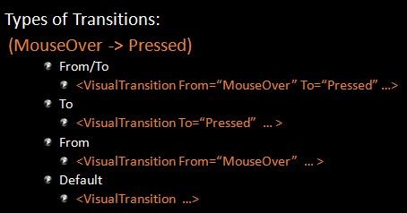
What happens when our CheckBox goes from MouseOver to Pressed? VisualStateManager looks first for a From=”MouseOver”/To=”Pressed transition. If it doesn’t find it, VSM then searches for a To=”Pressed” transition, and then, if necessary, a From=”MouseOver” transition. Finally, if it still hasn’t found a transition, VSM will use the default transition for that state group. If there was no default transition defined, it will use a zero length duration.
By giving specific VisualTransition for certain state changes, our CheckBox now looks and feels exactly the way we want!
Give the final app a try here. You can also grab the final XAML for the CheckBox skin as well as the full app sample code.
VisualStateManager
We’ve saw it briefly in the last post, but let’s formally introduce VisualStateManager. 

VisualStateManager is the class responsible for control visual state management. The “visual” modifier in that sentence is important - the control logic remains in charge of the logical state machine.
VSM exposes two main pieces of PME:
- a VisualStateGroups attached property
- This property is set on the control template’s root visual and contains all the visual states & transitions for that skin
- a static GoToState() method
- This method causes VisualStateManager to transition the control’s visuals from one visual state to another.
Last time, we concentrated on the VisualStateGroups property in XAML. Today, we’ll dig into how the control code leverages that GoToState() method.
WeatherControl
The custom control that we’ll be looking at today is a simple WeatherControl. The shell of the control code can be found below. (Note: For readability, I’ve collapsed some of the code snippets. You can find the full sample code here.)
1: public class WeatherControl : Control
2: { 3:4: public WeatherControl()
5: {6: DefaultStyleKey = typeof(WeatherControl);
7: } 8:9: // OnApplyTemplate()
10: public override void OnApplyTemplate()
11: {12: base.OnApplyTemplate();
13: } 14:15: // Temperature DP
  16:     public static readonly DependencyProperty TemperatureProperty =
                    DependencyProperty.Register("Condition", typeof(Condition), typeof(WeatherControl),null);
17: public string Temperature
18: { 19: get { ... } 20: set { ... } 21: } 22:23: // Condition DP
  24:     public static readonly DependencyProperty ConditionProperty =
               DependencyProperty.Register("Condition", typeof(Condition), typeof(WeatherControl),
               new PropertyMetadata(new PropertyChangedCallback(WeatherControl.OnConditionPropertyChanged)));
25: public Condition Condition
26: { 27: get { ... } 28: set { ... } 29: } 30:31: // ConditionDescription DP
  32:     public static readonly DependencyProperty ConditionDescriptionProperty =
             DependencyProperty.Register("ConditionDescription", typeof(string), typeof(WeatherControl), null);
33: public string ConditionDescription
34: { 35: get { ... } 36: set { ... } 37: } 38:39: // Property change notification
40: private static void OnConditionPropertyChanged(DependencyObject d, DependencyPropertyChangedEventArgs e)
41: {42: WeatherControl weather = d as WeatherControl;
43: ...44: weather.OnWeatherChange(null);
45: } 46:47: // OnWeatherChange virtual
48: protected virtual void OnWeatherChange(RoutedEventArgs e)
49: { 50: } 51: 52: }You can see that our WeatherControl…
- is a custom control, deriving from Control.
- defines its own built-in style, as indicated by the DefaultStyleKey.
- has 3 public dependency properties:
- Temperature
- Condition
- ConditionDescription
In order to make our WeatherControl skinnable with VSM, we need to:
- define a control contract
- discover & manipulate parts
- wire up appropriate state changes using VisualStateManager
Here we go!
Defining the Control Contract
The control code is responsible for documenting the control contract. This means it should declare any and all expected Parts and States. This is done using class level metadata:
1: [TemplatePart(Name="Core", Type=typeof(FrameworkElement))]
2:3: [TemplateVisualState(Name="Normal", GroupName="CommonStates")]
4: [TemplateVisualState(Name="MouseOver", GroupName="CommonStates")]
5: [TemplateVisualState(Name="Pressed", GroupName="CommonStates")]
6:7: [TemplateVisualState(Name="Sunny", GroupName="WeatherStates")]
8: [TemplateVisualState(Name="PartlyCloudy", GroupName="WeatherStates")]
9: [TemplateVisualState(Name="Cloudy", GroupName="WeatherStates")]
10: [TemplateVisualState(Name="Rainy", GroupName="WeatherStates")]
11: public class WeatherControl : Control
12: { 13: ... 14: }In the above snippet, there are two attribute classes:
- TemplatePartAttribute
- Specifies the name of the part & expected type
- TemplateVisualStateAttribute
- Specifies the name of the state & its associated state group
This metadata is not used by the runtime. However, it is leveraged by tools like Expression Blend for their skinning support.
These attributes on the WeatherControl give rise to this control bill of materials:

Now, let’s see how the control code manipulates Parts.
Discovering Parts
Parts are named elements in the template and need to be manually discovered by the control code. This is done in the OnApplyTemplate() virtual, which is called whenever a new template is applied.
1: // OnApplyTemplate
2: public override void OnApplyTemplate()
3: {4: base.OnApplyTemplate();
5:6: CorePart = (FrameworkElement)GetTemplateChild("Core");
7: } 8:9: // private CorePart property
10: private FrameworkElement CorePart
11: { 12: get 13: {14: return corePart;
15: } 16: 17: set 18: { 19: FrameworkElement oldCorePart = corePart; 20:21: if (oldCorePart != null)
22: {23: oldCorePart.MouseEnter -= new MouseEventHandler(corePart_MouseEnter);
24: oldCorePart.MouseLeave -= new MouseEventHandler(corePart_MouseLeave);
25: oldCorePart.MouseLeftButtonDown -= new MouseButtonEventHandler(corePart_MouseLeftButtonDown);
26: oldCorePart.MouseLeftButtonUp -= new MouseButtonEventHandler(corePart_MouseLeftButtonUp);
27: } 28:29: corePart = value;
30:31: if (corePart != null)
32: {33: corePart.MouseEnter += new MouseEventHandler(corePart_MouseEnter);
34: corePart.MouseLeave += new MouseEventHandler(corePart_MouseLeave);
35: corePart.MouseLeftButtonDown += new MouseButtonEventHandler(corePart_MouseLeftButtonDown);
36: corePart.MouseLeftButtonUp += new MouseButtonEventHandler(corePart_MouseLeftButtonUp);
37: } 38: } 39: }To find a named element inside of the template, you use the GetTemplateChild() helper method.
In the above example, we discover the “Core” part, which we will use to determine when the control should go into the MouseOver or Pressed states. Note that the setter logic is resilient to the Core part not being in the template. This is important, because a control needs to be robust enough to handle a part that is missing or not yet been added.
Initiating State Changes
The control code is responsible for telling VisualStateManager when a visual state change should occur. Therefore, it must maintain the logical state machine that is associated with the visual state machine.
All of Silverlight 2’s built-in controls create a simple helper method to assist with the state changes. We recommend that you follow a similar pattern:
1: // GoToState() helper
2: private void GoToState(bool useTransitions)
3: {4: // Go to states in NormalStates state group
5: if (isPressed)
6: {7: VisualStateManager.GoToState(this, "Pressed", useTransitions);
8: }9: else if (isMouseOver)
10: {11: VisualStateManager.GoToState(this, "MouseOver", useTransitions);
12: }13: else
14: {15: VisualStateManager.GoToState(this, "Normal", useTransitions);
16: } 17:18: // Go to states in WeatherStates state group
19: if (Condition == Condition.PartlyCloudy)
20: {21: VisualStateManager.GoToState(this, "PartlyCloudy", useTransitions);
22: }23: else if (Condition == Condition.Sunny)
24: {25: VisualStateManager.GoToState(this, "Sunny", useTransitions);
26: }27: else if (Condition == Condition.Cloudy)
28: {29: VisualStateManager.GoToState(this, "Cloudy", useTransitions);
30: }31: else
32: {33: VisualStateManager.GoToState(this, "Rainy", useTransitions);
34: } 35: }The GoToState helper method contains a series of if statements which determine the current visual states. It then tells VisualStateManager to initiate the appropriate state change. This is done with the static public static bool VisualStateManager.GoToState(Control control, string stateName, bool useTransitions) method.
As you can see, this method…
- has 3 parameters:
- control: instance of the control
- stateName: name of the visual state to go to
- usetTransitions: flag to determine whether transitions should be run in this state change
- returns a bool
- It returns true if the state name was found and false otherwise.
- is a no op if…
- the control was already in the passed in visual state
- the visual state cannot be found
Most control authors will call their GoToState() helper in 3 places:
- OnApplyTemplate() with no transitions.
- When the control first appears, we generally want it to just appear in the appropriate state, and not transition into it.
- In certain property change notification handlers
- In certain event handlers
For our WeatherControl, we add these calls:
1: // OnApplyTemplate
2: public override void OnApplyTemplate()
3: {4: base.OnApplyTemplate();
5:6: CorePart = (FrameworkElement)GetTemplateChild("Core");
7:8: GoToState(false);
9: } 10:11: // Property Change Notifications
12: protected virtual void OnWeatherChange(RoutedEventArgs e)
13: {14: GoToState(true);
15: } 16:17: // Event Handlers
18: void corePart_MouseEnter(object sender, MouseEventArgs e)
19: {20: isMouseOver = true;
21: GoToState(true);
22: } 23:24: void corePart_MouseLeave(object sender, MouseEventArgs e)
25: {26: isMouseOver = false;
27: GoToState(true);
28: } 29:30: void corePart_MouseLeftButtonDown(object sender, MouseButtonEventArgs e)
31: {32: isPressed = true;
33: GoToState(true);
34: } 35:36: void corePart_MouseLeftButtonUp(object sender, MouseButtonEventArgs e)
37: {38: isPressed = false;
39: GoToState(true);
40: }For the WeatherControl, we need to initiated state changes when:
- the template is first applied
- the Condition property is changed
- mouse events are raised from the Core part
Adding a Built-In Style
So now we have our control logic!
I’ve cooked up a very fun (if I do say so myself) ControlTemplate to show off our WeatherControl. The “fun” makes the template a bit long, however. Here’s the editted version:
1: <!-- VisualStateManager -->
2: <vsm:VisualStateManager.VisualStateGroups>
3:4: <!-- CommonStates StateGroup-->
5: <vsm:VisualStateGroup x:Name="CommonStates">
6:7: <!-- CommonStates States-->
8: <vsm:VisualState x:Name="Normal"/>
9: <vsm:VisualState x:Name="MouseOver"><Storyboard> ... </Storyboard></vsm:VisualState>
10: <vsm:VisualState x:Name="Pressed"><Storyboard> ... </Storyboard></vsm:VisualState>
11:12: <!-- CommonStates Transitions-->
13: <vsm:VisualStateGroup.Transitions>
14: <vsm:VisualTransition GeneratedDuration="0:0:.6"/>
15: <vsm:VisualTransition To="Pressed" GeneratedDuration="0:0:.4"/>
16: <vsm:VisualTransition From="Pressed" GeneratedDuration="0:0:.4"/>
17: </vsm:VisualStateGroup.Transitions>
18:19: </vsm:VisualStateGroup>
20:21: <!-- WeatherStates StateGroup-->
22: <vsm:VisualStateGroup x:Name="WeatherStates">
23:24: <!-- WeatherStates States-->
25: <vsm:VisualState x:Name="Sunny"/>
26: <vsm:VisualState x:Name="PartlyCloudy""><Storyboard> ... </Storyboard></vsm:VisualState>
27: <vsm:VisualState x:Name="Cloudy"><Storyboard> ... </Storyboard></vsm:VisualState>
28: <vsm:VisualState x:Name="Rainy"><Storyboard> ... </Storyboard></vsm:VisualState>
29:30: <!-- WeatherStates Transitions-->
31: <vsm:VisualStateGroup.Transitions>
32: <vsm:VisualTransition GeneratedDuration="0:0:.3"/>
33: </vsm:VisualStateGroup.Transitions>
34:35: </vsm:VisualStateGroup>
36:37: </vsm:VisualStateManager.VisualStateGroups>
As you can see from this ControlTemplate, I’ve:
- defined all 7 VisualStates.
- leveraged storyboard resources to define the state storyboards
- supplied a default VisualTransition for both the CommonStates and WeatherStates
- specified VisualTransitionss for certain state changes in the CommonStates
Let’s run it!
Adding Specialized Transitions
The generated transitions work well for our WeatherControl. However, being ambitious, let’s add more customized visual transitions between certain state changes.
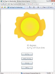
Here’s our skin in the different weather states:

When our control goes from Sunny to PartlyCloudy, we don’t want the cloud to to just gradually animate in. Instead, we’d like it to zoom from the left.

In order to create a custom transition like this, you can specify an explicit transition storyboard:
1: <!-- WeatherStates Transitions-->
2: <vsm:VisualStateGroup.Transitions>
3:4: <!-- Sunny to PartlyCloudy Transition -->
5: <vsm:VisualTransition
6: From="Sunny" To="PartlyCloudy"
7: GeneratedDuration="0:0:.5">
8: <Storyboard Duration="0:0:.5">
9: <DoubleAnimationUsingKeyFrames
10: BeginTime="00:00:00"
11: Storyboard.TargetName="BottomCloud"
12: Storyboard.TargetProperty="(UIElement.RenderTransform).(TransformGroup.Children)[3].(TranslateTransform.X)">
13: <SplineDoubleKeyFrame KeyTime="00:00:00" Value="-150"/>
14: <SplineDoubleKeyFrame KeyTime="00:00:00.5000000" Value="0" KeySpline="0.173,0.019,1,0.484"/>
15: </DoubleAnimationUsingKeyFrames>
16: <DoubleAnimationUsingKeyFrames
17: BeginTime="00:00:00"
18: Storyboard.TargetName="BottomCloud" Storyboard.TargetProperty="(UIElement.Opacity)">
19: <SplineDoubleKeyFrame KeyTime="00:00:00" Value="0"/>
20: <SplineDoubleKeyFrame KeySpline="0.173,0.019,1,1" KeyTime="00:00:00.2000000" Value="0.1"/>
21: <SplineDoubleKeyFrame KeyTime="00:00:00.5000000" Value="1" KeySpline="0,0,1,0.484"/>
22: </DoubleAnimationUsingKeyFrames>
23: </Storyboard>
24: </vsm:VisualTransition>
25:26: <!-- WeatherStates Default Transition -->
27: <vsm:VisualTransition Duration="0:0:.3"/>
28:29: </vsm:VisualStateGroup.Transitions>
Now, when VisualStateManager is generating transitions animations for the Sunny to PartlyCloudy state change, it will no longer generate animation for the BottomCloud’s opacity. It will just run the explicit transition storyboard with its two double animations.
To better understand stand how generated transition animations interact with explicit transitions storyboards, let’s look at an example:

Here, we have two visual states: Foo & Bar. They each animate a different (partially overlapping) set of properties.
How do the the transition animations get built up?
- VSM will generate transition animations for properties A, C, and D.
- A, C, and D are animated in one or both of the two states, AND are not animated in the explicit VisualTransition.Storyboard storyboard.
- VSM will run the explicit transition storyboard to transition properties B, E, and G
- B, E, and G are animated by VisualTransitoin.Storyboard. VSM does not need to generate transition animations for these properties.
- VSM will not animate the transition of property F.
- F is animated with an ObjectAnimation in the Foo & Bar states. It’s not possible for VSM to programmatically generate a linear transition animation for an ObjectAnimation. Therefore, property F will simply snap into its Bar value after the transition animations have run.
Going back to our WeatherControl, I’ve also added explicit transitions for Sunny->PartlyCloudy, Sunny->Cloudy, and PartlyCloudy->Cloudy.
Run the application one last time to see our final look! You can also grab the source code here.
Parts & States Model Recommendations
1. Use the Parts & States Model with Custom Controls and UserControls
Like we mentioned in the first post, the Parts & States Model is just a pattern. It is not required by the runtime, and it’s perfectly fine to build controls without the Parts & States Model and VisualStateManager.
However, we do think this is a good model. And Blend will only be able to support skinning of custom controls using the Parts & States Model.
And while this series concentrated on VSM with Custom Controls, remember you can use it with UserControls as well!
2. Custom VSM xmlns
This one is less of a recommendation and more of a heads up.
Because of a known Silverlight 2 Beta 2 bug, you need to use a custom xmlns for VisualStateManager and its related classes.
1: xmlns:vsm=“clr-namespace:System.Windows;assembly=System.Windows”For consistency across controls, we recommend the following naming convention.

4. CommonStates and FocusStates are special
Many controls define these two state groups:

If your control is going to have some or all of these states, for consistency, we recommend the above grouping and naming.
5. Be resilient to missing Parts & States in template
There are many reasons why a particular ControlTemplate might not supply a given part or state: the designer may have deliberately chosen to leave it out. He/she might not have created it yet. And so on.
It is good practice to prevent crashes or other catastrophic failures when a part is missing.
Note: The VisualStateManager.GoToState() method already takes care of this for states - it returns false when the target VisualState is not found.
6. Consider supporting “fallback” states
For complex controls, it is sometimes interesting to provide a fallback mechanism for particular states that do not exist.
1: if (VisualStateManager.GoToState(this, “FocusContent”, useTransitions) == false)
2: { 3: VisualStateManager.GoToState(this, “Focus", useTransitions);
4: } The advantage of this approach are pretty intuitive: the control continues to visually function correctly when a designer hasn’t provided a particular state.
But there are also some significant negatives: the fallback states mechanism isn’t fully integrated into the Parts & States model, which means that Blend has no way of knowing about them.
So, please use fallback states sparingly and only when the control is sufficiently complex enough to warrants it.
Also, if you think this is a pattern that you’ll leverage often, let us know! We’d love the feedback.
7. Subclasses should only add states in new state groups (not existing state groups)
As you know, each state group is orthogonal. This makes it easy for a subclass to add new state groups. For instance, you can create a StackButton that derives from Button and adds a StackStates group:

This works because the StackStates state group logic is completely independent from the Button’s logic around CommonStates & FocusStates.
However, if you want to add a new state to an existing state group, the state group logic can become jumbled. It’s is difficult to guarantee that the right logical state checks will happen in the right order.
Let’s make this clearer with an example. BasicControl defines two states in its CommonStates: Normal, MouseOver. Its logical state machine is:
- if (mouse is not over control) goto Normal
- if (mouse is over control) goto MouseOver
Now, ExtendedControl derives from BasicControls and wants to add a Pressed state. The goal logical state machine would be:
- if (mouse is not over control) goto Normal
- if (mouse is over control AND mouse button is not down) goto MouseOver
- if (mouse button is down) goto Pressed
However, there is no good for way for ExtendedControl to add the (AND mouse button is not down) check for the MouseOver state, since that logic lives in the Button base class.
All this just means: Subclasses can always add new states to an new state group. But we recommend against adding new states to existing state groups.
Note: There are different ways (each with its own pluses & minuses) for the platform to address this limitation in a future version. We’re currently leaning towards a Triggers-based solution (yes, I said triggers). For more, keep reading.
Looking Ahead
VSM & Windows Presentation Foundation
Silverlight’s Parts & States Model leverages many features (like ControlTemplates, GetTemplateChild() helpers, etc) that already exist in Windows Presentation Foundation.

However, there are some features - namely VisualStateManager and its associated classes - that do not yet exist in WPF. The good news is that the next version of Windows Presentation Foundation will include VisualStateManager!
For some that are trying to move their Siverlight 2 controls & skins to WPF now, the next version of the .NET framework may feel a ways off. To help remedy that, we are currently looking into shipping a WPF assembly that contains VisualStateManager before the next full release of WPF. Plans are still early - and so the timeline & ship vehicle details are still being worked out.
More details as we have them!
Future Silverlight Features
One of the often asked questions about the Silverlight control model is: “Where are the Triggers?” In fact, it’s normally, “Where are the TRIGGERS?????”
There are a lot of different reasons why we were not able to bring Triggers into the Silverlight 2 release. The primary technical challenge was that our property system architecture is not sufficiently complex to support them. This will however change in a future version of Silverlight, and then we’ll be able to start supporting Triggers.
How would Triggers & VSM play together? The tentative design brainstorm looks something like:
1: <PropertyTrigger Property="IsPressed" Value="True">
2: <GoToState State="Pressed"/>
3: </PropertyTrigger>
The platform would provide a GoToState trigger action that causes VisualStateManager to initiate a state change to the desired state.
The designer would, then, have the option of using the built-in states that come with the control (and leaving the visual state change logic to the control). OR, he/she can take over and trigger all the VSM state changes from XAML. In the latter case, it would also be possible for the designer to add states to new or existing state groups that a control code does not know about.
Exciting stuff coming!
The End
So that’s the end of our 4 part series on the Silverlight 2 Parts & States Model. If you have questions or feedback, we’d love to hear it.
If this series has wet your appetite for VisualStateManager, here are some more great resources:
- Christian Schormann’s Blog (Group Program Manager for Expression Blend)
- Steve White’s video tutorials (Program Manager for Expression Blend)
- Celso Gomes’s tutorials (Designer for Expression Blend)
- Tim Heuer’s Blog (Senior Program Manager on the .NET Developer Platform)
- Jesse Liberty’s tutorials (Senior Program Manager on the .NET Developer Platform)
- Scott Guthrie’s Blog (Corporate Vice President of the Developer Division)