使用 ReactDOM.createPortal 可將子元素渲染到外部任意 DOM 節點中,避免子元素因父元素的樣式影響無法正常顯現,其中最常受父元素屏蔽影響的例子就是 Modal 彈跳視窗,本文簡單介紹如何實作通用性的 Modal 組件。
前言
當實作 Modal 組件沒有考量到彈跳視窗 DOM 渲染的位置時,很有機會被父元素樣式給遮蔽而無法順利顯示,因此可透過 ReactDOM.createPortal 方法可將 child 元素渲染到外部任意元素中,只需指定特定元素節點 (e.g. body) 即可,這樣就不必再擔心 Modal 視窗被遮蔽無法顯示了。
實作
彈跳視窗 TpModal 組件的基本組成包括背景 Backdrop、視窗 Modal、視窗標題 ModalHeader 及視窗內容 ModalContent 組件區塊。
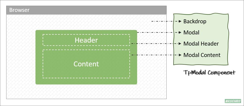
可以從外部透過 isVisible 控制彈跳視窗的出現與否,並傳入 title 及 children 表示視窗標題與內容,另外用戶可使用 maxWidth 參數自行決定視窗寬度,組件代碼如下。
import React from 'react'
import PropTypes from 'prop-types'

const TpModal = ({ title, isVisible, children, maxWidth } = { children: [] }) => {
  // render
  return isVisible
    ? (
      <Backdrop>
        {/* 彈跳視窗 */}
        <Modal maxWidth={maxWidth}>

          {/* 標頭 */}
          <ModalHeader>
            <ModalTitle> {title} </ModalTitle>
          </ModalHeader>

          {/* 內容 */}
          <ModalContent>
            {children}
          </ModalContent>

        </Modal>
      </Backdrop>
    )
    : null
}

TpModal.propTypes = {
  children: PropTypes.node,
  isVisible: PropTypes.bool,
  title: PropTypes.string,
  maxWidth: PropTypes.string
}

export default TpModal
以上使用到的 styled-components 樣式組件如下。
import styled from 'styled-components'

const Backdrop = styled.div`
  background: #0000002e;
  /* z-index: 99; */
  position: fixed;
  top: 0;
  bottom: 0;
  left: 0;
  right: 0;
  display: flex;
  align-items: center;
  justify-content: center;
`

const Modal = styled.div`
  background: white;
  border-radius: 5px;
  width: 100%;
  max-width: ${props => props.maxWidth || '60%'} ;
  max-height: 100vh;
  box-shadow: 3px 3px 9px 1px silver;
  display: flex;
  flex-direction: column;
`

const ModalHeader = styled.div`
  padding: 20px;
  display: flex;
  position: relative;
`

const ModalTitle = styled.div`
  font-weight: bold;
  flex: 1;
  text-align: center;
`

const ModalContent = styled.div`
  padding: 0 20px 20px 20px;
  overflow-y: auto;
  max-height: 50vh;
`
執行
操作 TpModal 的方式如下:
- 定義 isVisible 狀態來決定彈跳視窗是否出現。
- 定義切換 isVisible 方法。
- 傳入 isVisible 到 TpModal 組件中決定是否顯示,視窗內容直接包在組件內即可。
- 透過 Show Modal 按鈕讓彈跳視窗出現。
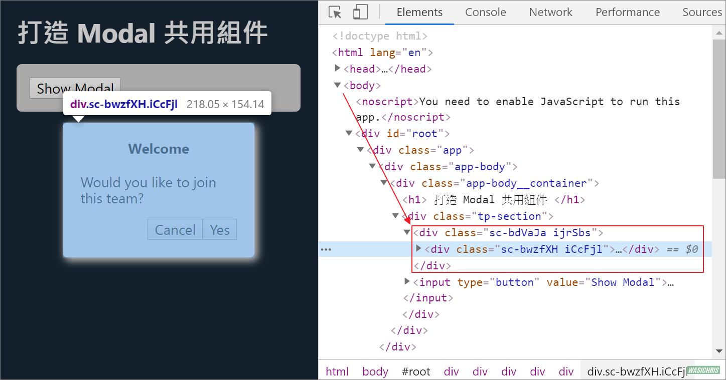
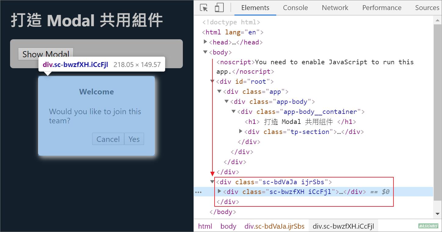
顯示彈跳視窗時可以看到 DOM 出現在比較深的位置 (為 TpModal 組件實際的擺放處)。
跳出父層範圍
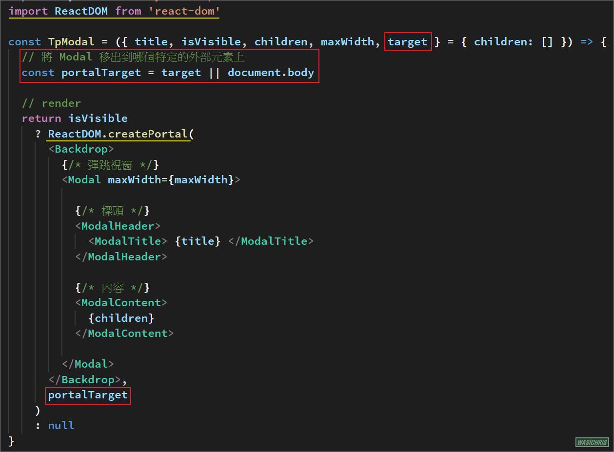
這時候可以使用 ReactDOM.createPortal 方法將 TpModal 渲染時移動到特定 target 節點上,且為兼容性所以當無設定 target 時自動加到 document.body 節點下。
再執行一次,彈跳視窗 DOM 節點已經附屬在 body 之下,這樣就較不易受到父元素樣式影響了。
附加功能
既然主功能都寫出來了,也試著實做下列常見操作吧!
- 加上右上角 X 圖示來關閉視窗。
- 允許點選背景 Backdrop 關閉視窗。
- 允許按下 Esc 鍵來關閉視窗。
- 鎖定畫面,避免頁面 Scrollbar 出現影響操作。
加上關閉視窗圖示
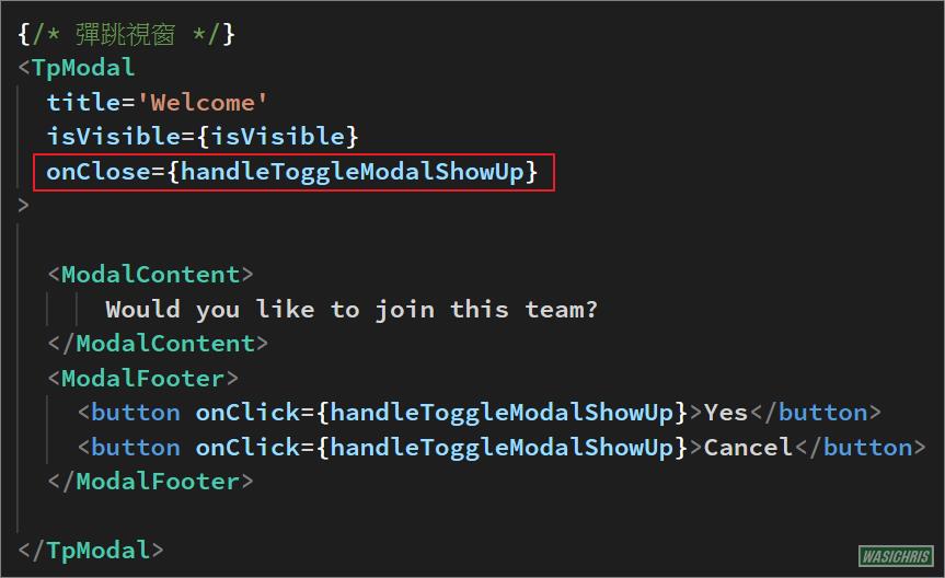
這部分比較單純,在 TpModal 補上圖示按鈕 ModalCloseBtn 就完成一大半了;由於視窗顯示與否是由外部控制,所以必須由外部傳入 onClose 方法讓組件內可執行關閉視窗的行為。
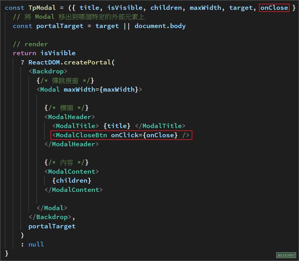
在使用端只要記得傳入 onClose 關閉視窗方法就好了。
執行看看確實可以於 TpModal 中主動執行關閉視窗行為。

點選 Backdrop 關閉視窗
有些情境用戶會希望在點選 Backdrop 背景時自動關閉彈跳視窗,所以可作動範圍為下圖淺紅色部分。
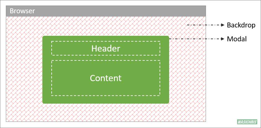
接著需要在 Backdrop 加上 onClick 事件,點擊的時候去判斷目前位置是否在 Backdrop 上且不落入 Modal 區塊範圍中,至於 Modal 區塊範圍可以使用 ref 取得 DOM 元素作為判斷依據。
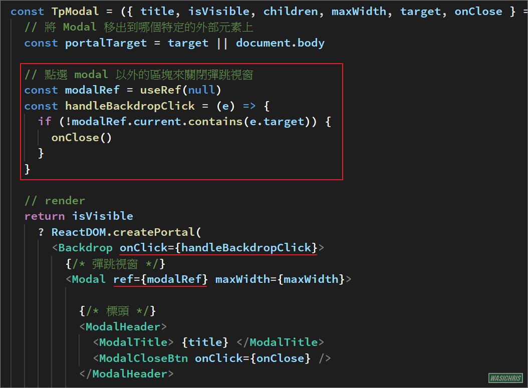
執行看看,功能達成目標。

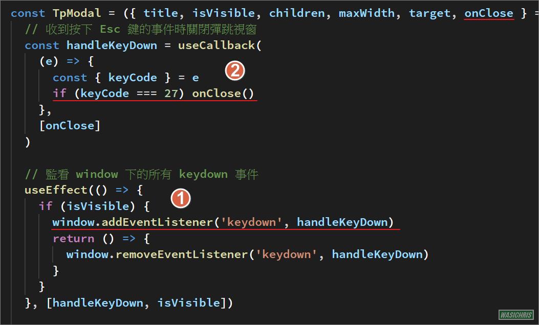
按下 Esc 鍵來關閉視窗
有時候也需要提供用戶按下 Esc 鍵時關閉彈跳視窗的功能,實作方式如下:
- 直接監聽 window 範圍的 KeyDown 事件。 (請記得在 cleanup 方法中取消監聽喔!)
- 只要在收到 Esc 鍵按下事件時,執行關閉視窗方法即可。
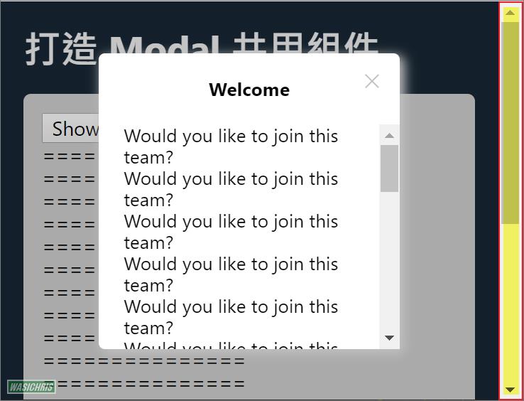
鎖定畫面
頁面內容較多時會有 scrollbar 出現,當彈跳視窗出現時會希望該 scrollbar 消失,讓畫面能被鎖定來避免背景畫面滾動的混亂。
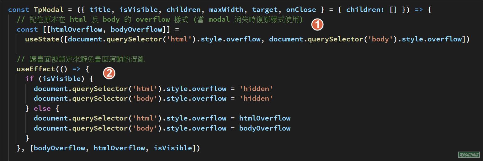
主要操作 html , body 的 overflow 樣式為 hidden 來達到鎖定畫面的效果,只有在彈跳視窗出現時才有此效果,關閉後須回復原本樣式,實作方式如下:
- 紀錄原本 html 及 body 的 overflow 樣式 (當彈跳視窗 modal 消失時復原樣式使用)。
- 當 modal 出現讓畫面被鎖定,而 modal 消失則復原成原本的樣式。
效果如下

完整測試代碼
TpModal.js
import React, { useRef, useEffect, useCallback, useState } from 'react'
import PropTypes from 'prop-types'
import styled from 'styled-components'
import ReactDOM from 'react-dom'

const TpModal = ({ title, isVisible, children, maxWidth, target, onClose } = { children: [] }) => {
  // 將彈跳視窗移出到特定的元素上
  const portalTarget = target || document.body

  // 點選 Backdrop (不含modal) 來關閉彈跳視窗
  const modalRef = useRef(null)
  const handleBackdropClick = (e) => {
    if (!modalRef.current.contains(e.target)) {
      onClose()
    }
  }

  // 收到按下 Esc 鍵的事件時關閉彈跳視窗
  const handleKeyDown = useCallback(
    (e) => {
      const { keyCode } = e
      if (keyCode === 27) onClose()
    },
    [onClose]
  )

  // 監看 window 下的所有 keydown 事件
  useEffect(() => {
    if (isVisible) {
      window.addEventListener('keydown', handleKeyDown)
      return () => {
        window.removeEventListener('keydown', handleKeyDown)
      }
    }
  }, [handleKeyDown, isVisible])

  // 記住原本在 html 及 body 的 overflow 樣式 (當 modal 消失時復原樣式使用)
  const [[htmlOverflow, bodyOverflow]] =
    useState([document.querySelector('html').style.overflow, document.querySelector('body').style.overflow])

  // 讓畫面被鎖定來避免畫面滾動的混亂
  useEffect(() => {
    if (isVisible) {
      document.querySelector('html').style.overflow = 'hidden'
      document.querySelector('body').style.overflow = 'hidden'
    } else {
      document.querySelector('html').style.overflow = htmlOverflow
      document.querySelector('body').style.overflow = bodyOverflow
    }
  }, [bodyOverflow, htmlOverflow, isVisible])

  // render
  return isVisible
    ? ReactDOM.createPortal(
      <Backdrop onClick={handleBackdropClick}>
        {/* 彈跳視窗 */}
        <Modal ref={modalRef} maxWidth={maxWidth}>

          {/* 標頭 */}
          <ModalHeader>
            <ModalTitle> {title} </ModalTitle>
            <ModalCloseBtn onClick={onClose} />
          </ModalHeader>

          {/* 內容 */}
          <ModalContent>
            {children}
          </ModalContent>

        </Modal>
      </Backdrop>,
      portalTarget
    )
    : null
}

TpModal.propTypes = {
  children: PropTypes.node,
  isVisible: PropTypes.bool,
  title: PropTypes.string,
  maxWidth: PropTypes.string,
  onClose: PropTypes.func.isRequired
}

const Backdrop = styled.div`
  background: #0000002e;
  /* z-index: 99; */
  position: fixed;
  top: 0;
  bottom: 0;
  left: 0;
  right: 0;
  display: flex;
  align-items: center;
  justify-content: center;
`

const Modal = styled.div`
  background: white;
  border-radius: 5px;
  width: 100%;
  max-width: ${props => props.maxWidth || '60%'} ;
  max-height: 100vh;
  box-shadow: 3px 3px 9px 1px silver;
  display: flex;
  flex-direction: column;
`

const ModalHeader = styled.div`
  padding: 20px;
  display: flex;
  position: relative;
`

const ModalTitle = styled.div`
  font-weight: bold;
  flex: 1;
  text-align: center;
`

const ModalContent = styled.div`
  padding: 0 20px 20px 20px;
  overflow-y: auto;
  max-height: 50vh;
`

const ModalCloseBtn = styled.div`
  cursor:pointer;
  position: absolute;
  right: 15px;
  top: 15px;
  width: 15px;
  height: 15px;
  opacity: 0.3;

  :hover {
    opacity: 1;
  }

  :before, :after {
    position: absolute;
    left: 7px;
    content: ' ';
    height: 15px;
    width: 1px;
    background-color: #333;
  }

  :before {
    transform: rotate(45deg);
  }

  :after {
    transform: rotate(-45deg);
  }

`

export default TpModal
Demo.js
import React, { useState } from 'react'
import TpModal from '@src/components/TpModal/index'
import styled from 'styled-components'
const ModalFooter = styled.div`
display: flex;
flex-direction: row-reverse;
`
const ModalContent = styled.div`
margin-bottom: 15px;
`
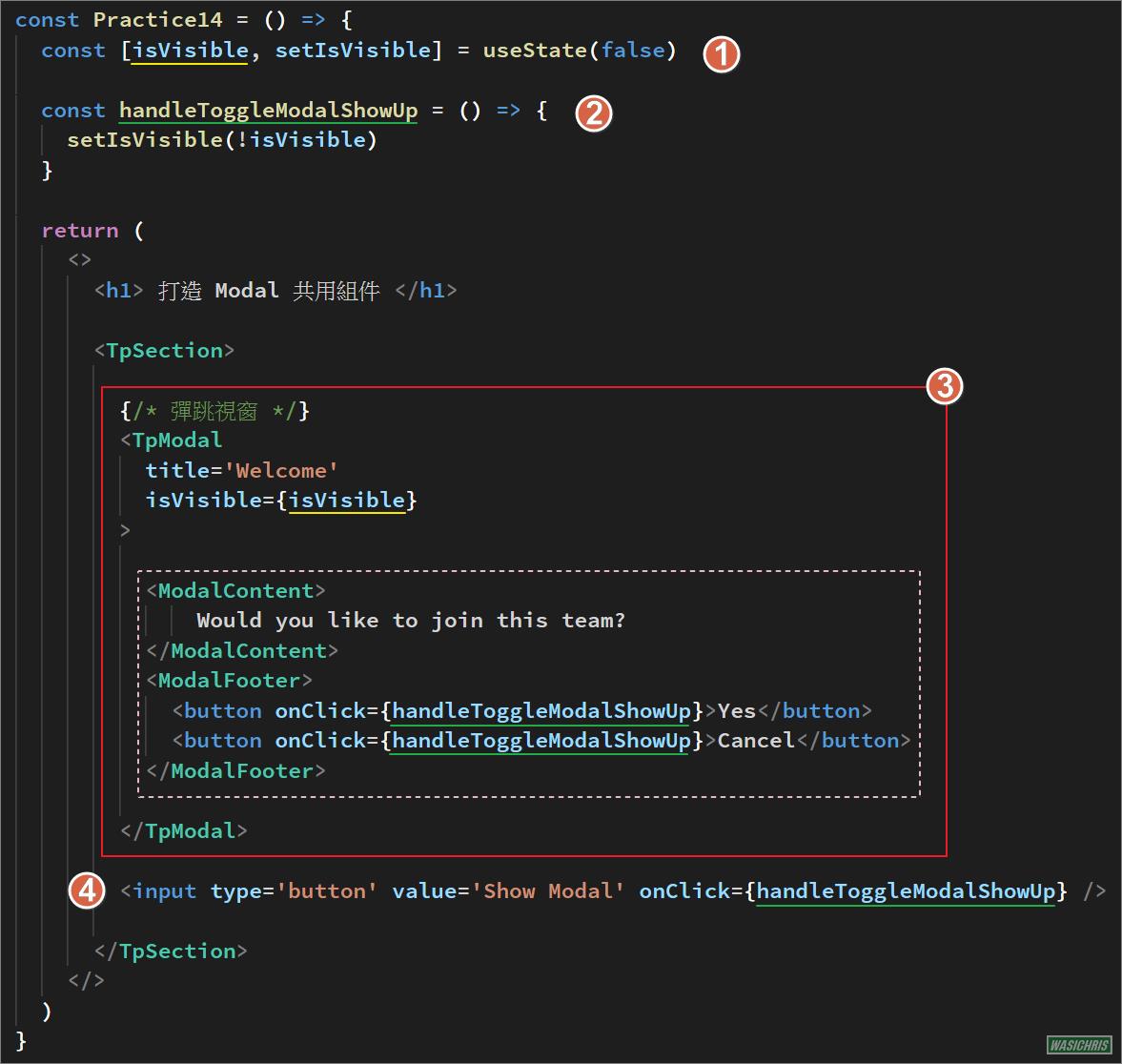
const Practice14 = () => {
const [isVisible, setIsVisible] = useState(false)
const handleToggleModalShowUp = () => {
setIsVisible(!isVisible)
}
return (
<>
<h1> 打造 Modal 共用組件 </h1>
{/* 開起視窗按鈕 */}
<input type='button' value='Show Modal' onClick={handleToggleModalShowUp} />
{/* 彈跳視窗 */}
<TpModal
title='Welcome'
isVisible={isVisible}
onClose={handleToggleModalShowUp}
>
<ModalContent>
<div> Would you like to join this team?</div>
</ModalContent>
<ModalFooter>
<button onClick={handleToggleModalShowUp}>Yes</button>
<button onClick={handleToggleModalShowUp}>Cancel</button>
</ModalFooter>
</TpModal>
</>
)
}
export default Practice14
希望此篇文章可以幫助到需要的人
若內容有誤或有其他建議請不吝留言給筆者喔 !